Cookbook
Cookbook.Rmdgsm.timez extends the GSM ecosystem with longitudinal
site-level monitoring. Where standard GSM metrics provide a
cross-sectional snapshot of each site’s performance,
gsm.timez tracks how cumulative event rates evolve month by
month, applying gsm.core::Analyze_NormalApprox() at each
time step to flag sites whose trajectory diverges from the study-wide
trend.
This vignette provides an overview of the main functions in
gsm.timez with usage examples.
Data Preparation
The examples use clindata sample data. Install it from
GitHub (Gilead-BioStats/clindata)
to explore the input datasets (rawplus_dm,
rawplus_ae, rawplus_visdt) and understand the
expected column structure.
dfSubjects <- clindata::rawplus_dm

dfNumerator <- clindata::rawplus_ae

dfDenominator <- clindata::rawplus_visdt %>%
  dplyr::mutate(visit_dt = as.Date(visit_dt, "%Y-%m-%d"))
Complete Pipeline
The full analysis chain from raw data to visualization:
gsm.timez::Timeline(
  dfSubjects            = dfSubjects,
  dfNumerator           = dfNumerator,
  dfDenominator         = dfDenominator,
  strGroupCol           = "invid",
  strSubjectCol         = "subjid",
  strNumeratorDateCol   = "aest_dt",
  strDenominatorDateCol = "visit_dt"
) %>%
  gsm.timez::Analyze_TimeZFunnel() %>%
  gsm.timez::Flag(vThreshold = c(-1.5, -1, 2, 3)) %>%
  gsm.timez::Visualize_Heatmap(nSites = 10)
#> ℹ Sorted dfFlagged using custom Flag order: 2.Sorted dfFlagged using custom Flag order: -2.Sorted dfFlagged using custom Flag order: 1.Sorted dfFlagged using custom Flag order: -1.Sorted dfFlagged using custom Flag order: 0.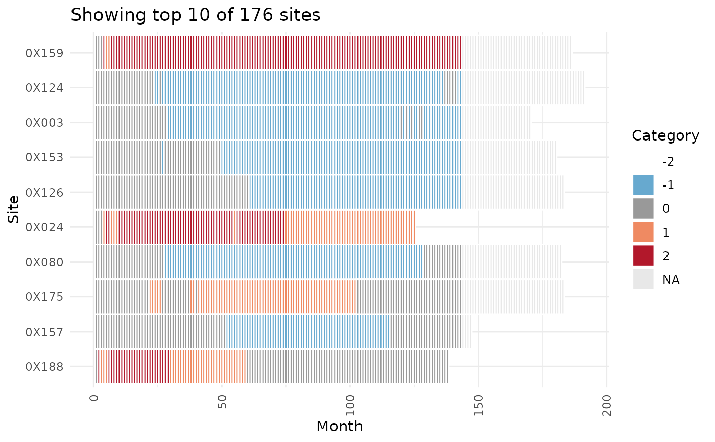
Step-by-Step Breakdown
The following sections walk through each function in the pipeline individually.
Timeline
Timeline() generates a site-level timeline of cumulative
numerator events over sequential months, producing one row per
site-month combination:
dfTimeline <- gsm.timez::Timeline(
  dfSubjects            = dfSubjects,
  dfNumerator           = dfNumerator,
  dfDenominator         = dfDenominator,
  strGroupCol           = "invid",
  strSubjectCol         = "subjid",
  strNumeratorDateCol   = "aest_dt",
  strDenominatorDateCol = "visit_dt"
)

knitr::kable(head(dfTimeline))| GroupID | GroupLevel | Numerator | Denominator | DenominatorMonth | NMonth |
|---|---|---|---|---|---|
| 0X001 | invid | 0 | 1 | 2009-06-01 | 1 |
| 0X001 | invid | 0 | 2 | 2009-07-01 | 2 |
| 0X001 | invid | 0 | 3 | 2009-08-01 | 3 |
| 0X001 | invid | 0 | 4 | 2009-09-01 | 4 |
| 0X001 | invid | 0 | 5 | 2009-10-01 | 5 |
| 0X001 | invid | 0 | 6 | 2009-11-01 | 6 |
Analyze_TimeZFunnel
Analyze_TimeZFunnel() applies
gsm.core::Analyze_NormalApprox() at each monthly
cross-section to calculate a funnel plot score for each site:
dfTimeZScore <- gsm.timez::Analyze_TimeZFunnel(dfTimeline)Flag
Flag() adds a Flag column identifying
statistical outliers based on z-score thresholds:
dfFlagged <- gsm.timez::Flag(dfTimeZScore, vThreshold = c(-1.5, -1, 2, 3))
#> ℹ Sorted dfFlagged using custom Flag order: 2.Sorted dfFlagged using custom Flag order: -2.Sorted dfFlagged using custom Flag order: 1.Sorted dfFlagged using custom Flag order: -1.Sorted dfFlagged using custom Flag order: 0.
Visualize_Heatmap
Visualize_Heatmap() creates a heatmap showing each
site’s flag status over time:
gsm.timez::Visualize_Heatmap(dfFlagged)
Visualize_Funnel
Visualize_Funnel() creates a funnel plot for a selected
month, showing site Metric values against their Denominator. The bounds
are computed by PredictBounds_TimeZFunnel(), which applies
gsm.core::Analyze_NormalApprox_PredictBounds() at each
month:
dfBounds <- gsm.timez::PredictBounds_TimeZFunnel(dfTimeZScore, vThreshold = c(-1.5, -1, 2, 3))
gsm.timez::Visualize_Funnel(dfFlagged, dfBounds = dfBounds)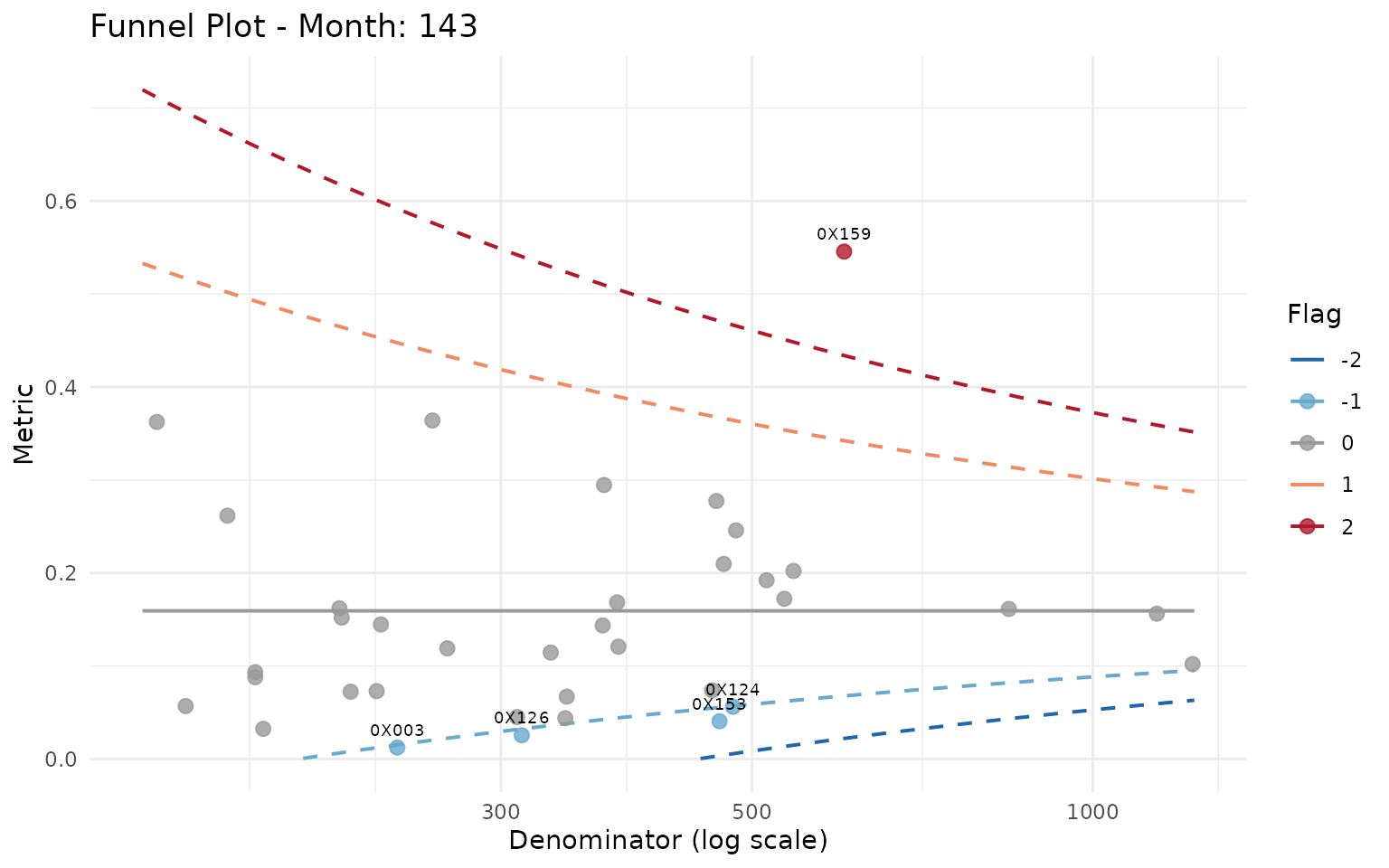
Visualize_Site
Visualize_Site() plots a single site’s cumulative metric
trajectory against all other sites, with colored dots marking flagged
months:
gsm.timez::Visualize_Site(dfFlagged, dfBounds = dfBounds, strSiteID = "0X159")
#> Warning: Removed 239 rows containing missing values or values outside the scale range
#> (`geom_line()`).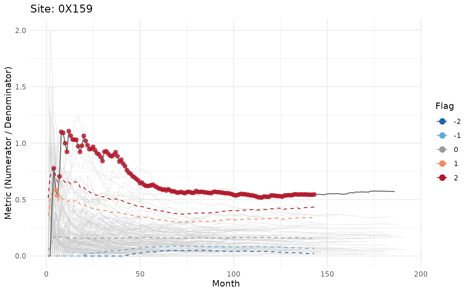
For YAML workflow integration and HTML report generation, see
vignette("gsm-workflow", package = "gsm.timez").