Visualize Site Cumulative Events Over Time with Flag Indicators
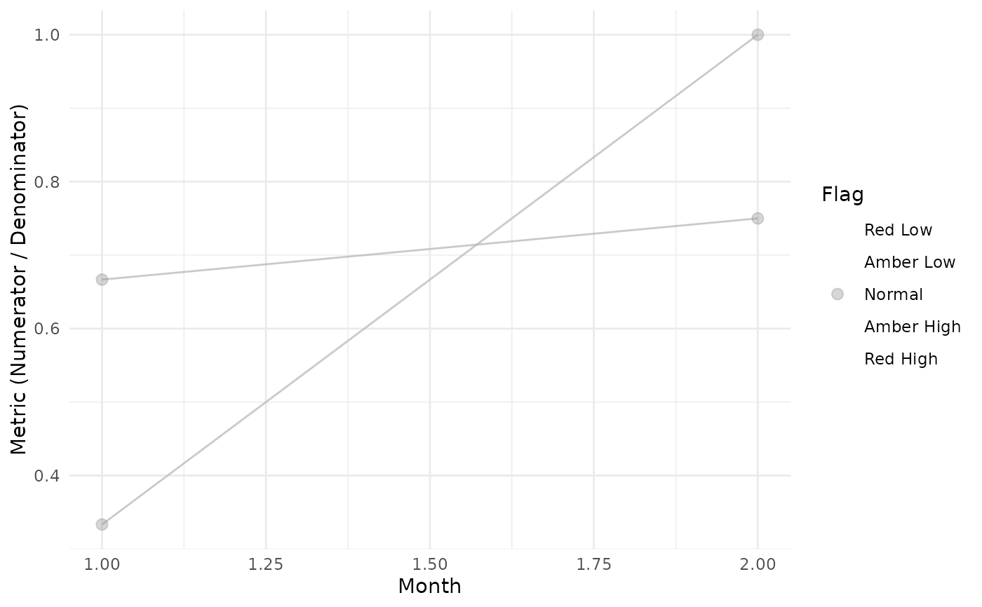
Visualize.RdCreates a line plot showing the cumulative Numerator (events) for each group over sequential months, with dots colored by Flag value to highlight outliers.
Value
A ggplot2 object showing Numerator vs NMonth with gray lines per site and dots colored by Flag value (diverging scale: red=low outlier, gray=normal, blue=high outlier).
Examples
library(dplyr)
dfSubjects <- data.frame(
  SubjectID = c(1, 2, 3, 4),
  SiteID = c("A", "A", "B", "B")
)
dfNumerator <- data.frame(
  SubjectID = c(1, 1, 2, 3, 4, 4, 4),
  EventDate = as.Date(c(
    "2022-01-01", "2022-01-15", "2022-02-01",
    "2022-01-10", "2022-01-05", "2022-01-20", "2022-02-01"
  ))
)
dfDenominator <- data.frame(
  SubjectID = c(1, 1, 2, 2, 3, 3, 4, 4),
  VisitDate = as.Date(c(
    "2022-01-01", "2022-01-20", "2022-01-01", "2022-02-01",
    "2022-01-01", "2022-01-15", "2022-01-01", "2022-02-01"
  ))
)

dfFlagged <- Timeline(
  dfSubjects = dfSubjects,
  dfNumerator = dfNumerator,
  dfDenominator = dfDenominator,
  strGroupCol = "SiteID",
  strSubjectCol = "SubjectID",
  strNumeratorDateCol = "EventDate",
  strDenominatorDateCol = "VisitDate"
) %>%
  TimeZScore() %>%
  Flag()
#> ℹ Sorted dfFlagged using custom Flag order: 2.Sorted dfFlagged using custom Flag order: -2.Sorted dfFlagged using custom Flag order: 1.Sorted dfFlagged using custom Flag order: -1.Sorted dfFlagged using custom Flag order: 0.

Visualize(dfFlagged)